
FIKA
This mid-century commercial building was ready for a transformation from its previous configuration as telecommunications office space use. Inspired by the incredible scale of its north-facing windows, The first order of business was to parse out the good from the bad. And so on day one we demoed out a cluster-fuck of partition walls, drop ceilings and well worn wall to wall carpeting. This allowed the original mid century design elements to inform the greater space unfettered. The bricks, vaulted ceiling, textured glass partition and the enormous north facing windows that look out to the courtyard were the redeeming features of the original architecture and would provide us some context for our work.
The cadence of the original window casings and the horizon line set therein informed the physical layout and its details continue throughout the space. Custom workstations were designed and set along the window banks. The horizon line of the original window casings was decided to be a defining feature, and as such set the height of all the added elements, thus seamlessly connecting the processing banquette, the color rinsing back bar, the work stations, the retail credenza on the main floor, all the way to the brass wainscoting in the bathroom. This continuity creates a cohesive unity of the furnishings added to the space while embracing the architectural bones, built-ins and stand alone pieces in harmony with the major architectural elements … calmness of the outer courtyard reflected on the north wall.
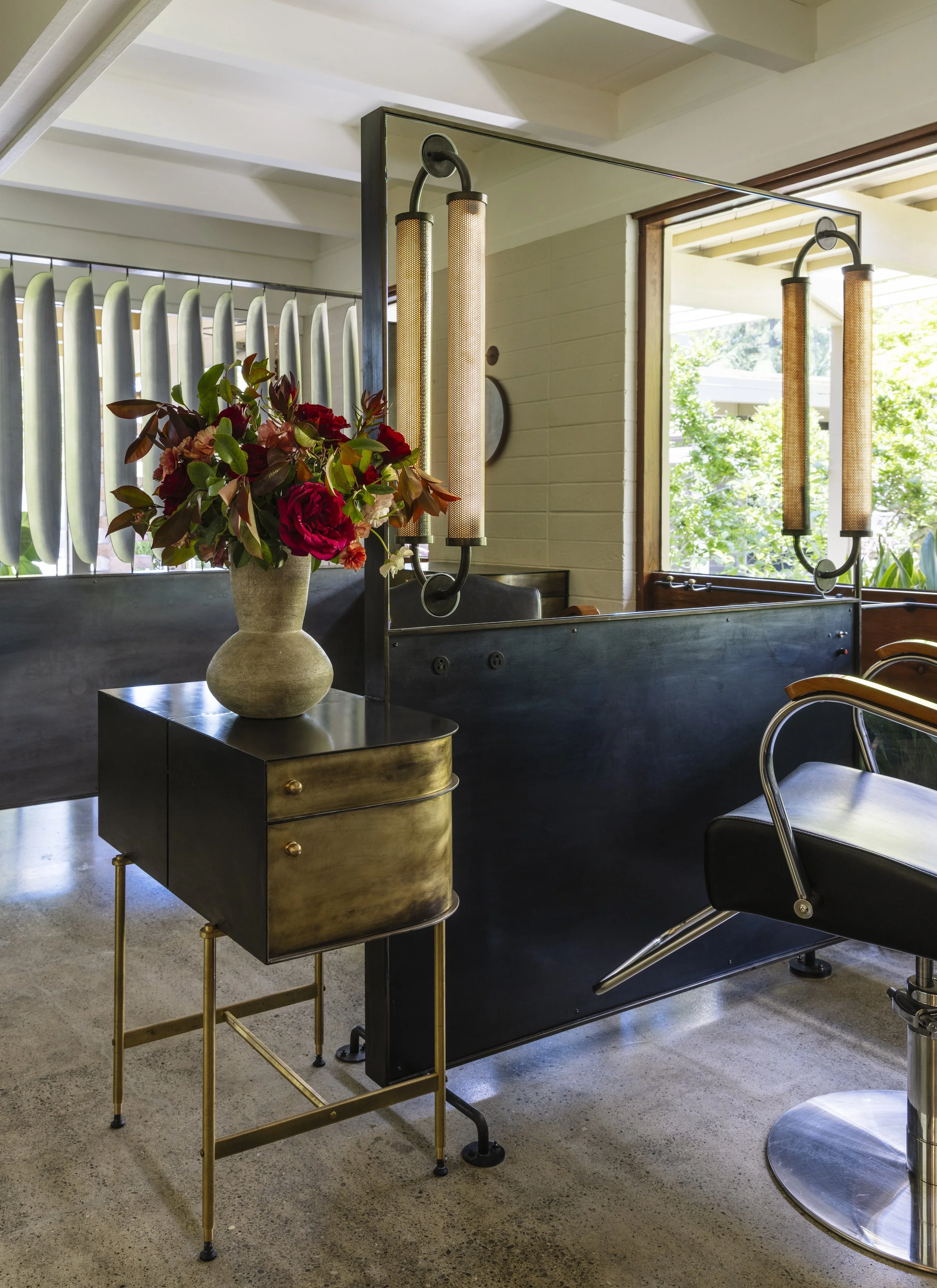

The stations are custom-built to effectively serve the craft of the stylists, the comfort of the clients, and an aesthetic that would work in harmony with the space. There is nothing quite like a custom built workstation to make a space feel both personal and well tuned for its purposes. Commercially built salon furniture couldn’t have hit all those marks. As such, four of our six stations are designed to accommodate both left- and right-handed stylists, featuring ample storage for shared space, vanity lamps built into the mirrors, and modern conveniences like accessible outlets for clients to use during their appointments.
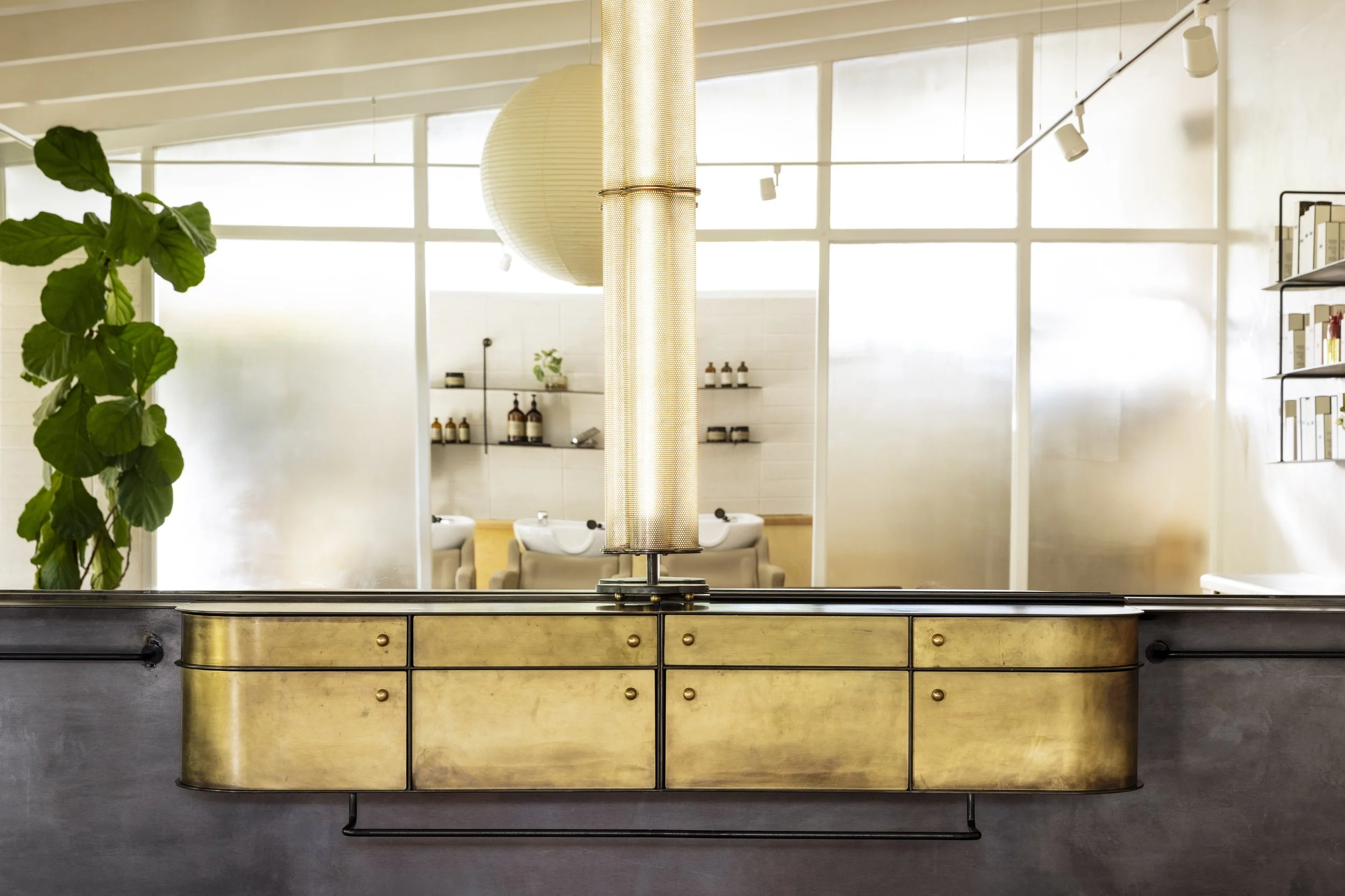
These stations aligned with the windows create a series of “suites” whose features and materiality would go on to inform the “grand station” in the center of the salon. The grand station is our main architectural addition to the space. And in fact provides two dividing walls that functionally partition the back of house from front of house. However its design is such that it reads as a large piece of furniture thoughtfully placed within the greater volume of the space, rather than a framed & dry walled floor to ceiling wall which could only divide the space and make it feel smaller and less rich of material. Key to achieving this is the soffit above the mirror, and the “bump-out” with a sidelight window on the right side of the station, and a perimeter of offset metal trim at the floor that provides a shadow line and which give the grand station its borders and a sense of independence from the building envelope. Again everything cohesive with each other and informed by the original architecture. Nothing superfluous, everything with a purpose.
The color palette was inspired by a painting by the client's mother, who also created the mural that greets visitors upon entry.
The juxtaposition of masculine and feminine shapes, raw natural materials, and sensual colors creates a lush, dimensional, and timeless atmosphere. We ensured every inch of the space was thoughtfully designed, fostering a cozy yet modern feel for the customers and custom tailored workflow and efficiency that supports the needs of a bustling business